A New Look
 I've finally updated my blog again. I've thrown away most of the old style and code. I needed a new look. Apparently a year ago I was a bit obsessed with low contrast and textures. These design concepts can work wonderfully. On my site they did not. I needed a new inspiration. One was not forthcoming.
About a month ago I started watching White Collar. I really liked the logo. It stuck with me. Last Friday I had a day off, so I decided to see if I was indeed "inspired". I suppose I was close enough. I am much happier with the current site design than the old one.
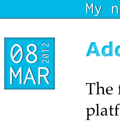 The rest of this paragraph may sound pretentious, and I apologize for that; however, I hope it gives some insight into the new design. The basic design language is that of a blue background overlain with a white sheet of material. The header and footer are on peeking out of the background. The blue headings and the date boxes are carved out of the white foreground to reveal the blue underneath. The white lettering in the header, footer, and date boxes are meant to be leftovers from white foreground material. The black text and images in the body of the page are sitting on top of the white foreground.
I also can't help but try out some new (to me) technologies, especially if they might be useful in my day job. I've used a bit of Sass in the context of Rails before, but I was interested in learning more about it. And this Compass thing I kept hearing about sounded really useful.
It turns out that I really like Sass and Compass. Together they give a front-end developer many wondrous tools. It would be hard to go back to not using variables and mixins. I also found Susy, a responsive grid framework, to be very useful.
Integrating Jekyll and Sass was not as easy as I had hoped. I at first tried the jeklyy-sass gem. I could not get it work after about half an hour of futzing with it. I assume this failing was on my part, not that of the gem. I think decided to do something a bit more simple. I followed the advice of another blog and just used the Jekyll and Compass command separately with foreman gluing them together.
I also took the opportunity to research fonts/typefaces to use. All really knew was that I wanted a strong sans serif font for the headings and a nice readable serif font for the body text. I did find two fonts that I really liked:
Eventually I decided that it really didn't make sense to pay for fonts on a blog that no one actually reads. So I decided to look up what fonts are installed by default and pick the my favorites (as it were). I landed on Verdana for the headings and Georgia for the body.I did wind up using one custom font: Inconsolata. I use this font in my text editor, so I decided to make the code snippets on my site use it. I found Font Squirrel's @font-face generator very useful
I couldn't figure out how to display each post's date until I stumbled across this post about CSS text rotation. I also had to brush up on CSS3 transitions to create the header. Making text look indented (or a letterpress effect) with CSS is surprisingly difficult. I found this gist incredibly useful.
I'm still not done. There are still some bugs especially on mobile devices. I will continue to refine and fix. Hopefully this version lasts longer than a year.